User Research, UX/UI, Service Design, UX Strategy
Made significant improvements to over 2.2 million new users 1st time experience using HelloFresh ultimately resulting in increasing the recurring customer count from 1.45 million to 7 million.
HelloFresh is the #1 meal kit subscription service company. Every week the customer selects their meals of choice and receives their delivery with pre-measured ingredients ready to be cooked.
As important as the action of selecting the users meals for the week is, the user is often left confused and frustrated, not knowing whether or not they have completed their meal selection or what the final price is.
User research, strategy, service design, and UX/UI design
Experience audit, user flows (physical and digital experience), wireframes, weekly stakeholder critiques, iterations and refinements, final responsive web designs, final design handoff to engineering team, user feedback and follow-up optimizations
We need to increase box 0 to box 2 retention.
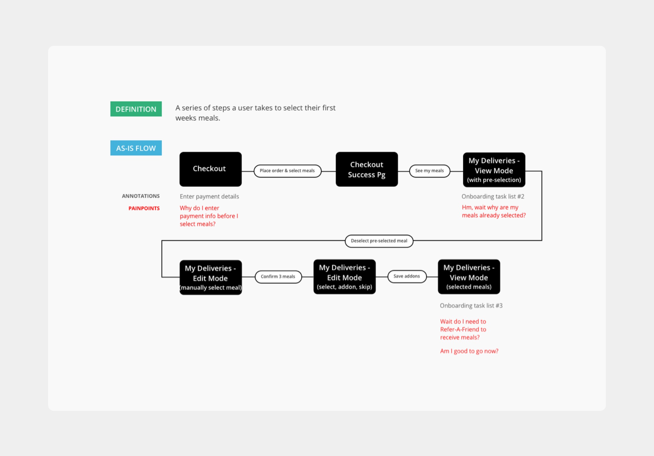
Map current as-is user experience
Gathered research via user feedback from Usabilla comments and data metrics from data analytics team
Unsure how to confirm their meal selection
Users make several loops through their weekly meal selection, which I hypothesized was due to the user being unsure if their meal selection was confirmed.
No awareness of total order price
Users have no idea what the price of their total order price is until they are ultimately billed.
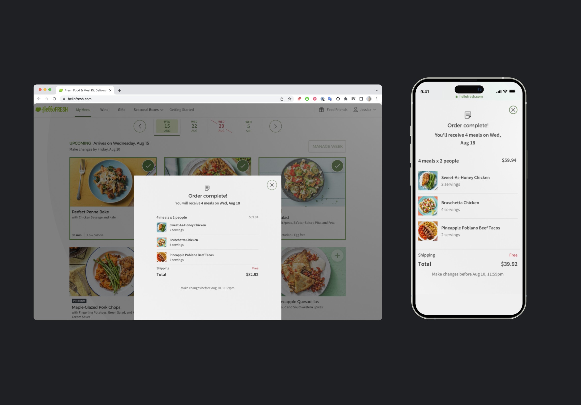
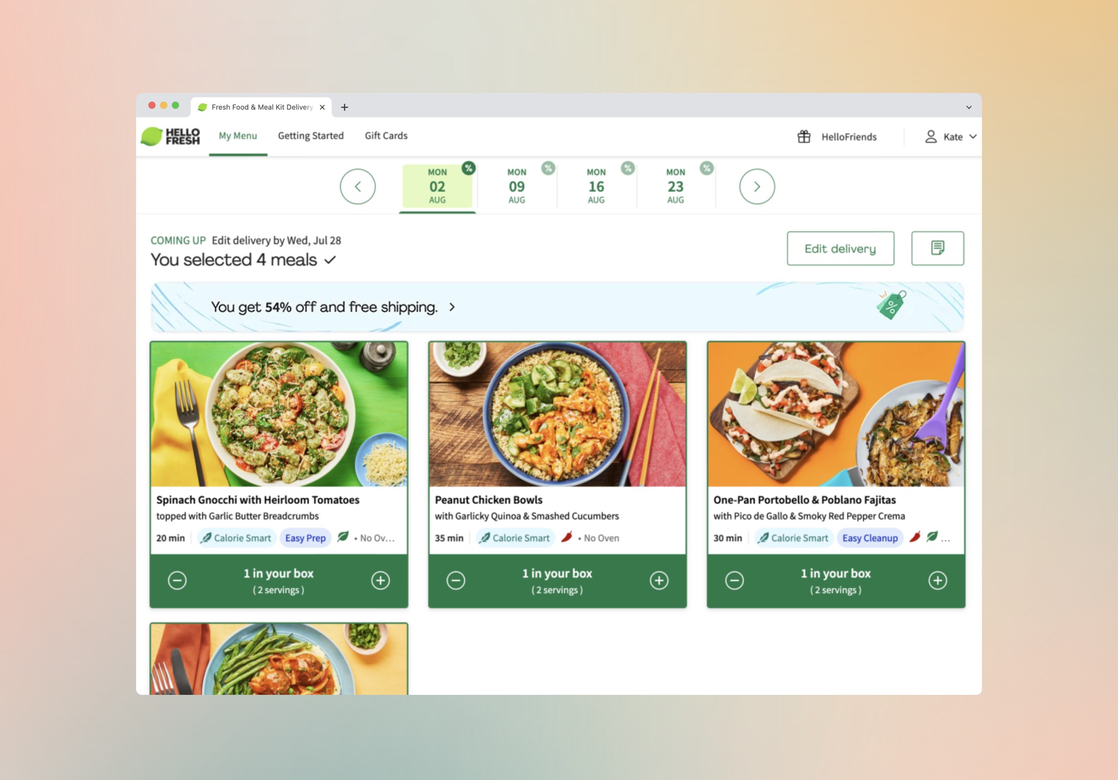
…better communicate to the user what is in their box (i.e. meals & price), and build confidence that they have completed their order?
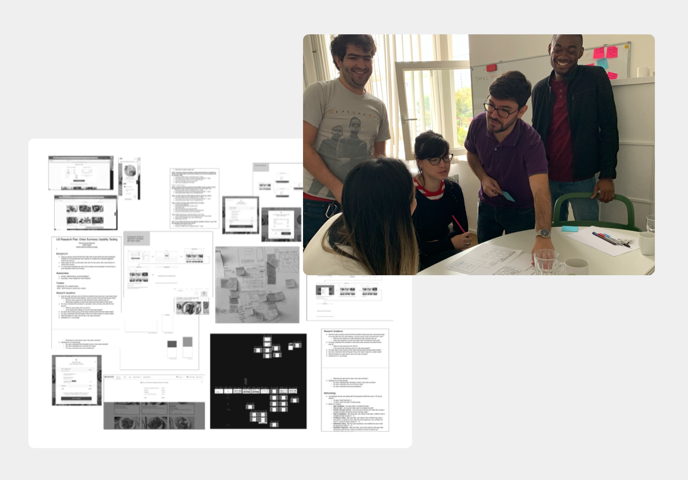
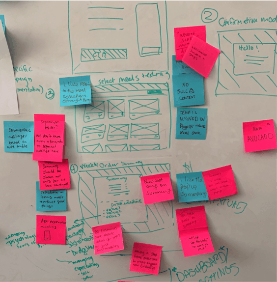
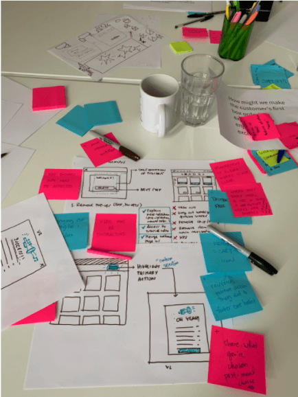
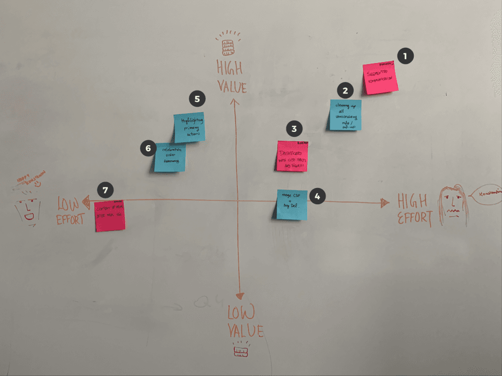
Ideation workshop with my agile team
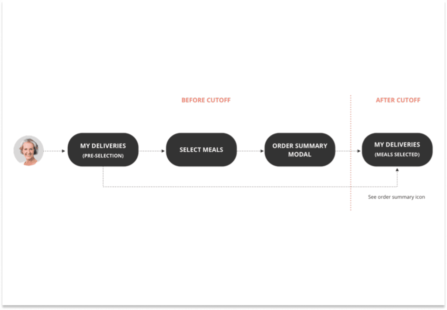
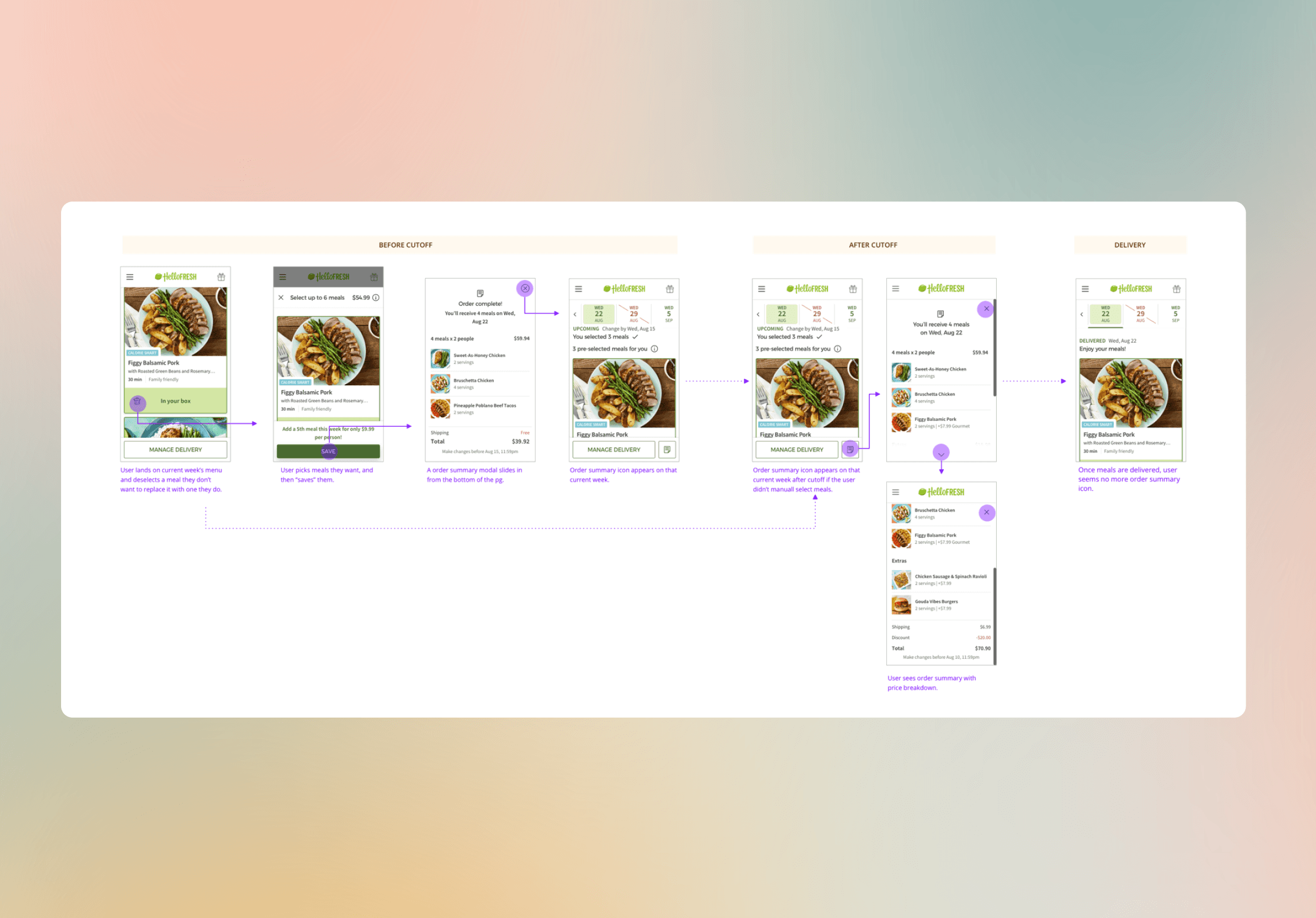
User flows
Wireframes
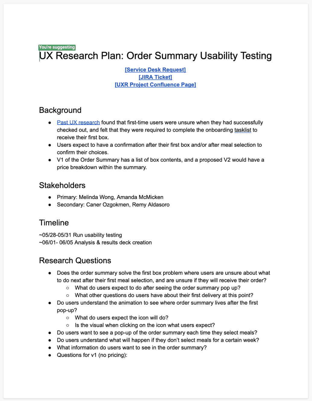
Prototyping & user testing
Weekly stakeholder critiques
Iterations and refinements
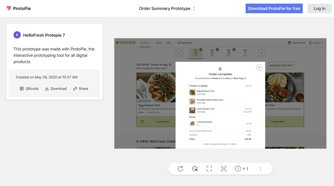
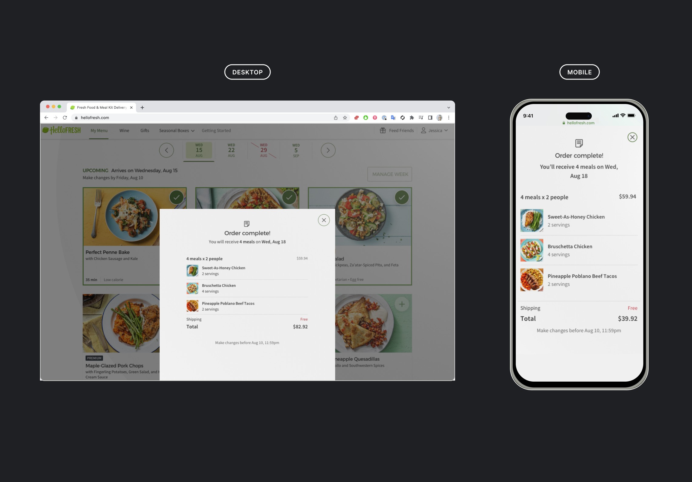
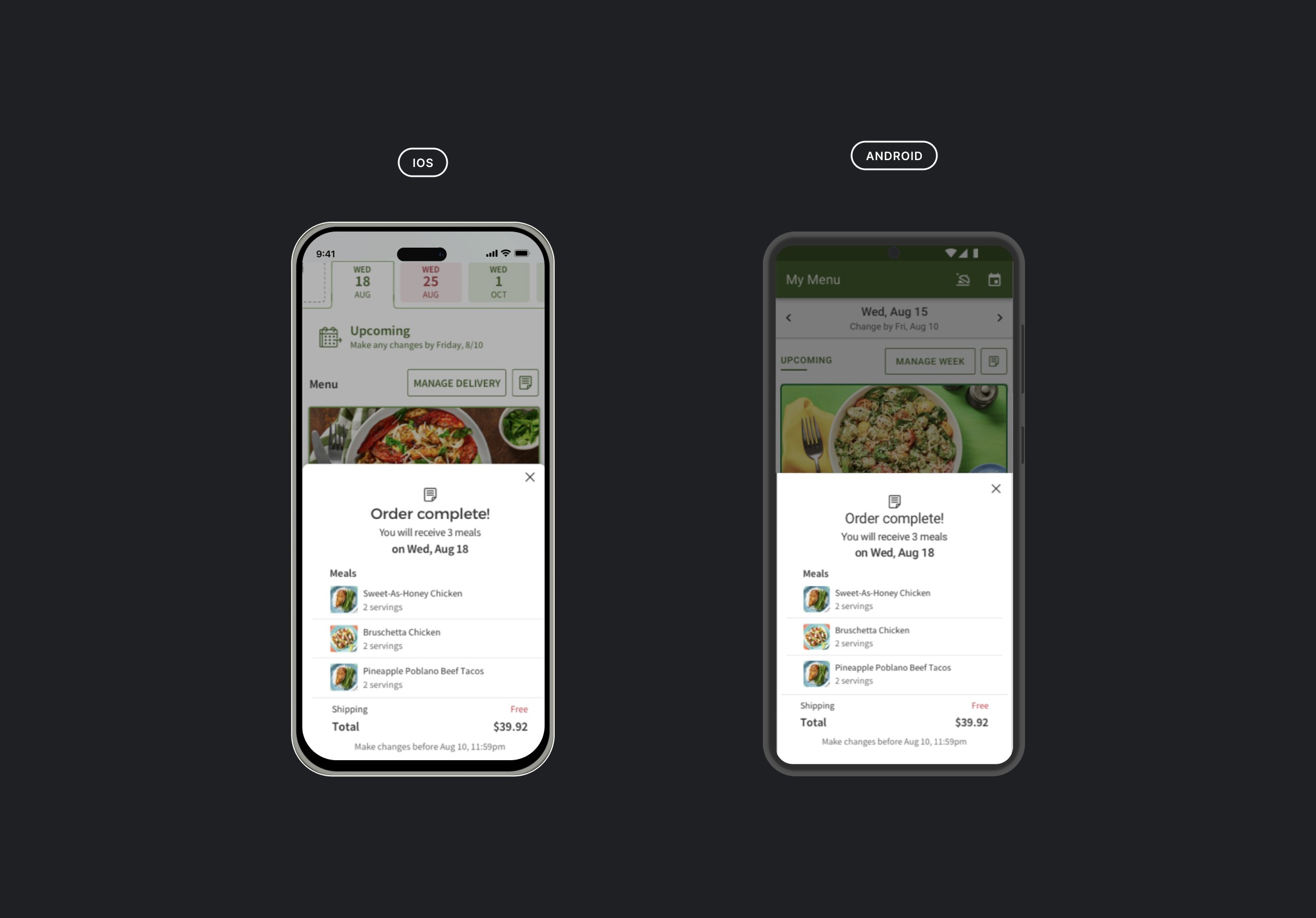
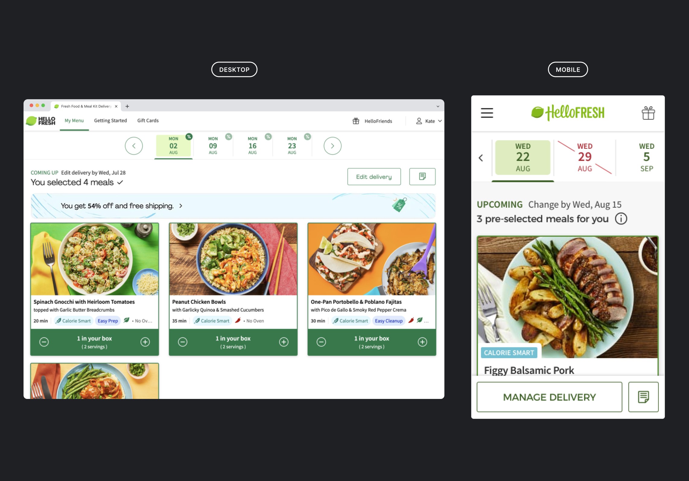
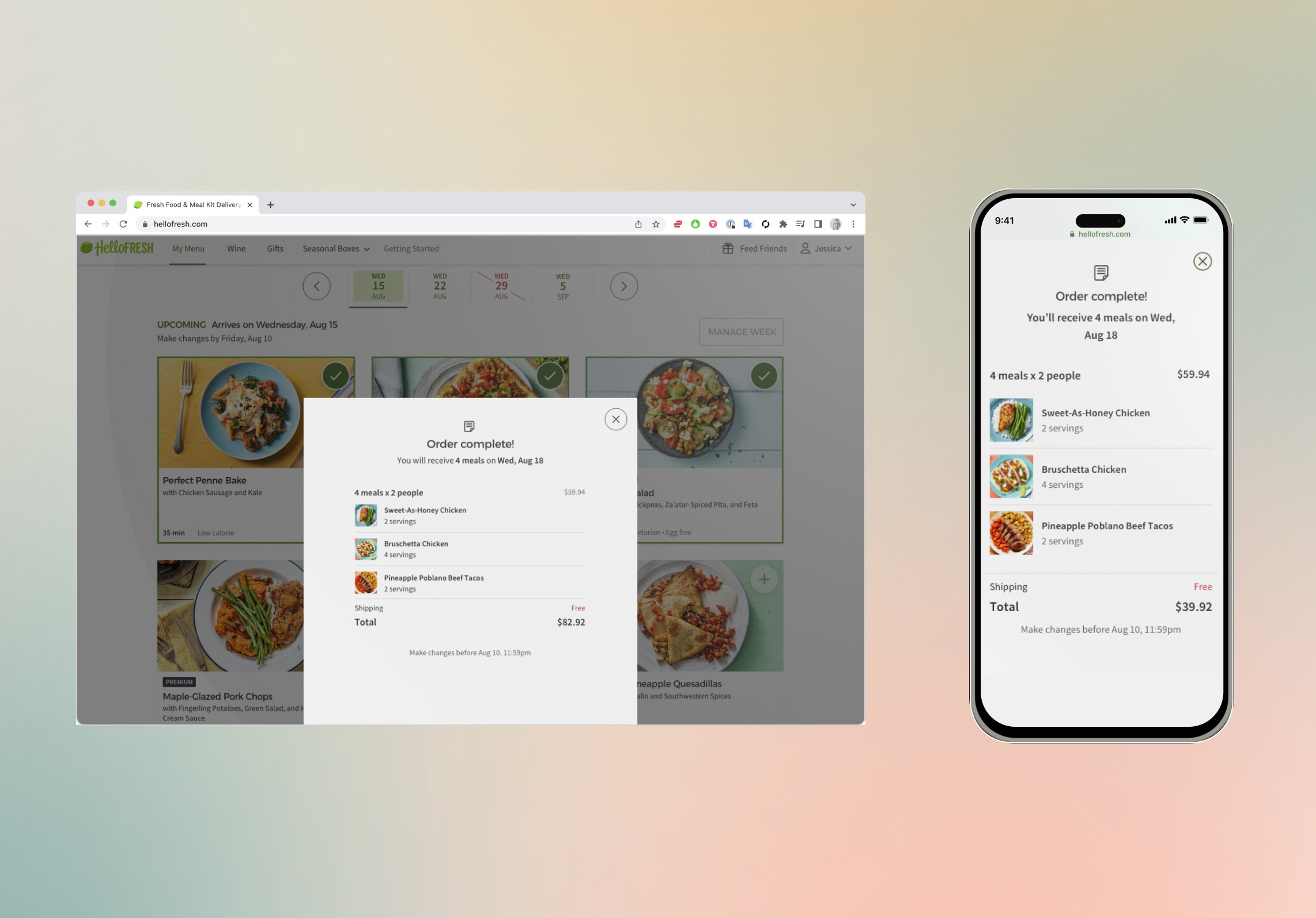
I created an order summary modal after weekly meal selection and a shortcut on the My Menu page to easily access your weekly order summary for both HelloFresh's responsive web experience as well as for their mobile apps (iOS and Android).

Transparency builds trust
Through reviewing user feedback, we found that users were often left frustrated only learning the total price of their meal box for that week after the fact. They didn't realize that they had selected meals that were added onto the base weekly box price. With such a sensitive topic as price, this led users to complain and ultimately leave for a competing brand.
With my new designs, that illuminated the price of each weekly box, we were able to increase net revenue by 4%, box 0-2 retention by 3%, pause rate by =3%, cancellation rate by -3%.

Be bold with bookending user actions
Users made several loops through meal selection because they hadn't realized they had completed their order for the week.
Our current onboarding task list was causing lots of confusion and frustration thinking they needed to refer a friend and rate a recipe in order to receive their box.
I removed the onboarding task list and tested an order confirmation after each initial weekly meal selection which increased net revenue by 4%, box 0-2 retention by 3%, pause rate by -3%, cancellation rate by -3%.
Melinda
Product Owner
Amanda McMicken (Me)
Product Designer
Joshua
Frontend Engineer
Chase
Backend Engineer
Camilo
QA Automation Engineer
Please reach out if you would like to see any project more in detail, interested to work with me, or just wanna grab a coffee and chat!
Amanda McMicken
